
Understanding PSD and the importance of WordPress in today’s digital landscape sets the stage for our journey into converting Photoshop designs (PSD) into fully functional WordPress websites. This process is not just about aesthetic appeal; it’s about creating a seamless user experience across various devices.
Table of Contents
- The Evolution of Mobile Responsive Design
- Why Choose WordPress for Mobile Responsive Design?
- Preparing Your PSD for Conversion
- The Conversion Process: Step-by-Step
- Ensuring Mobile Responsiveness
- Optimizing for Speed and Performance
- SEO Benefits of Mobile Responsive WordPress Sites
- Maintaining Your WordPress Site Post-Conversion
- Advanced Techniques and Tools
- Future Trends in Mobile Responsive Design
- Common Mistakes to Avoid
- Resources for Learning and Assistance
The Evolution of Mobile Responsive Design
The journey of mobile responsive design is a fascinating tale of adaptation and innovation in the digital world. In the early days of the internet, websites were designed for desktop computers, with fixed widths and layouts that catered to larger screens. This approach worked well until the advent of smartphones and tablets, which revolutionized how people accessed the internet.
As mobile devices gained popularity, it became evident that the traditional fixed-width designs were inadequate. Users found themselves constantly zooming in and out to read content, leading to a frustrating browsing experience. This challenge prompted the need for a more flexible, responsive web design approach.
The concept of responsive design emerged, championed by web designers and developers who recognized the need for websites to adapt seamlessly to various screen sizes. This approach uses fluid grids, flexible images, and CSS media queries to create a dynamic layout that adjusts to the screen it’s being viewed on.
The introduction of HTML5 and CSS3 played a pivotal role in advancing responsive design. These technologies provided more tools and capabilities, making it easier to create sophisticated, responsive websites. Today, mobile responsiveness is not just a trend but a fundamental aspect of web design, ensuring an optimal user experience across all devices. This evolution signifies the web’s responsive adaptation to user needs, marking a significant milestone in the digital era.
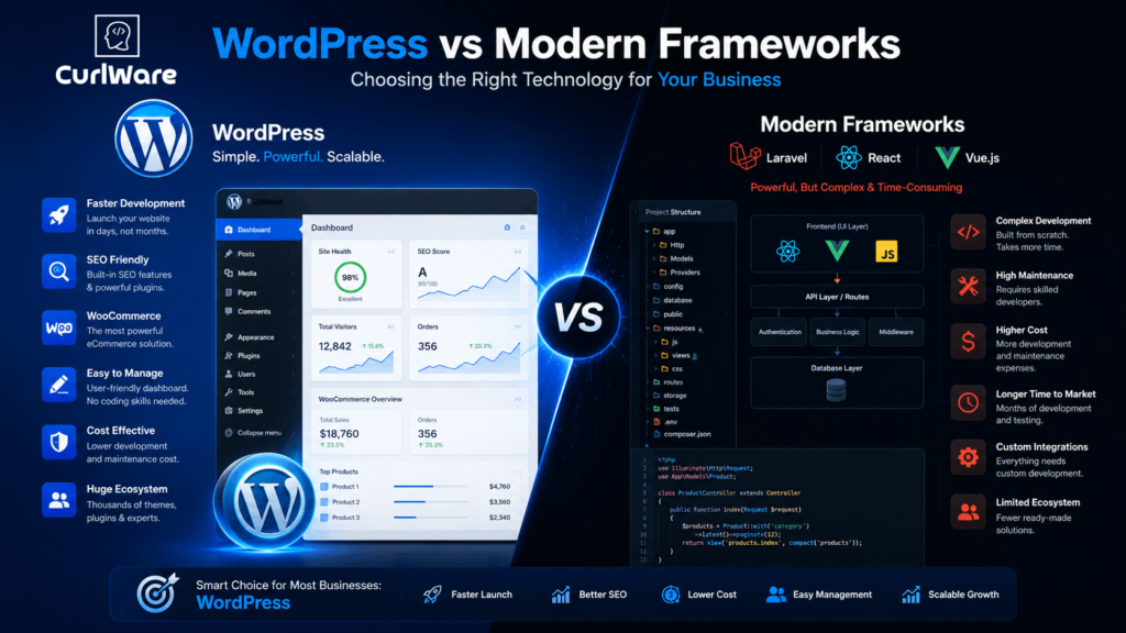
Why Choose WordPress for Mobile Responsive Design?
In the realm of web development, WordPress stands out as a premier choice for creating mobile responsive designs. Its popularity isn’t just due to its user-friendly interface or its status as a robust content management system; it’s also highly favored for its inherent responsiveness and adaptability to various screen sizes.
WordPress offers a plethora of inherently mobile-responsive themes. These themes ensure that your website automatically adjusts to fit the screen of any device, be it a smartphone, tablet, or desktop. This adaptability is crucial in today’s digital age, where mobile internet usage has surpassed desktop usage.
Moreover, WordPress’s responsive design capabilities are not just about automatic resizing. It’s about providing an optimal user experience. The platform allows for the creation of websites that are not only visually appealing on smaller screens but also maintain functionality and ease of navigation. This is essential for keeping your audience engaged, no matter the device they use.
Additionally, WordPress is SEO-friendly, which is vital for mobile responsiveness. Google favors mobile-friendly websites in its search rankings, and WordPress sites are designed to meet these search engine requirements. This means better visibility and higher rankings in search results, driving more traffic to your site.
Preparing Your PSD for Conversion
Designing with responsiveness in mind is crucial. This part focuses on optimizing your PSD files for a smooth transition to WordPress, ensuring that the design is adaptable to various screen sizes.
The Conversion Process: Step-by-Step
A detailed walkthrough of converting a PSD file into a WordPress theme. This includes slicing the PSD, creating HTML and CSS, and integrating these elements into WordPress, ensuring that the site remains responsive.
Ensuring Mobile Responsiveness
In the realm of PSD to WordPress conversion, ensuring mobile responsiveness is a critical step. It’s not just about making a website look good on a smartphone or tablet; it’s about providing a seamless, user-friendly experience across all devices. This process begins with a responsive design in your PSD file, where layouts are thoughtfully planned to adapt to various screen sizes.
Once your PSD design is converted into a WordPress theme, the real test of mobile responsiveness begins. This involves meticulous testing on different devices, including various smartphones and tablets, to check for consistency in design and functionality. Tools like Google’s Mobile-Friendly Test can be invaluable in this phase, offering insights into how well your site performs on mobile devices.
Common issues to watch for include unaligned elements, text that’s too small to read, images that don’t scale properly, and navigation menus that are difficult to use on a smaller screen. Solving these problems might involve tweaking CSS media queries, adjusting image sizes, and ensuring that all interactive elements are easily accessible on touchscreens.
Remember, mobile responsiveness is not just a design consideration; it’s essential for SEO and user engagement. A mobile-responsive WordPress site not only ranks better in search engines but also provides a better user experience, leading to increased traffic and engagement.
Optimizing for Speed and Performance
Site speed is a vital aspect of user experience and SEO. Here, we discuss the importance of performance and share tools and techniques to keep your WordPress site running smoothly and quickly.
SEO Benefits of Mobile Responsive WordPress Sites
A mobile-responsive site is more than just user-friendly; it’s also more likely to rank higher in search engine results. This part explains how mobile responsiveness directly impacts SEO.
Maintaining Your WordPress Site Post-Conversion
The work isn’t over after conversion. Regular updates and monitoring are essential to maintain the site’s performance and security. This section provides tips on keeping your WordPress site in top shape.
Advanced Techniques and Tools
For those looking to take their WordPress sites to the next level, this part explores advanced techniques and tools, including frameworks and plugins, that can enhance functionality and design.
Future Trends in Mobile Responsive Design
What does the future hold for mobile responsive design and WordPress development? This part makes predictions based on current trends and emerging technologies.
Common Mistakes to Avoid
Even the most experienced designers and developers can make mistakes. This section outlines common pitfalls in the PSD to WordPress conversion process and how to avoid them.
Resources for Learning and Assistance
For those who want to learn more or need professional assistance, this part lists valuable resources, including online tutorials and services.